Womb Fertility & Maternity Clinic

Womb Fertility & Maternity Centre
Healthcare
 Service Offered
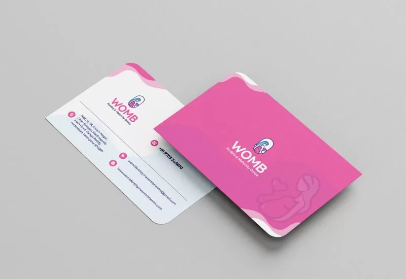
Logo, branding collaterals and signages.
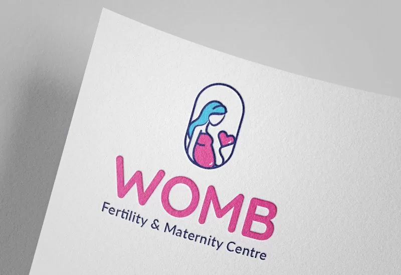
We were tasked with redesigning a contemporary logo for Womb Fertility & Maternity Centre, renowned for its exceptional tertiary care and specialization in mother and child care.
Goal

The client's goal was to have a logo that symbolizes the essence of fertility and maternity care while exuding a sense of contemporary elegance for their new venture.
Solution
Our solution involved crafting a logo featuring a pregnant woman holding a pink balloon, symbolizing love, nurture, and compassion. The light blue color chosen represents serenity, stability, and reliability, offering a calming effect. The overall design aims to convey a modern and soothing ambiance, aligning seamlessly with the center's ethos.
Result
The final result is a contemporary and emotionally resonant logo that embodies the spirit of Womb Fertility & Maternity Centre. The incorporation of light blue and pink adds a touch of serenity and love, creating a visual identity that not only speaks to their core services but also establishes a memorable and welcoming brand. The accompanying branding collaterals for the brand launch further solidify their image as a modern and compassionate healthcare provider.
